Qatarat
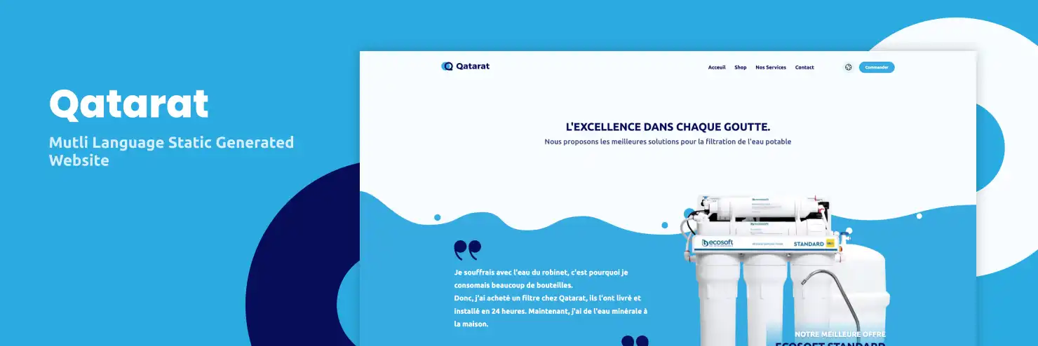
Multi-language website with a user-friendly ordering form and blazing fast performance.
Project Brief
Qatarat
The goal of this project was to create a multi-language website for Qatarat, a company specializing in innovative water solutions. The website serves as a platform for individuals and organizations to explore and order various water products and services.
Our Mission
We were tasked with designing and developing an intuitive, multi-language website that offers a seamless user experience for ordering water solutions.
Client
Qatarat
Team
Zakaria ELazrak
Duration
4 Months
Color Scheme
The color palette consists of shades of blue and green. Blue represents water and cleanliness, while green symbolizes freshness and sustainability. This color scheme conveys a sense of purity, reliability, and environmental consciousness, aligning perfectly with Qatarat's mission.
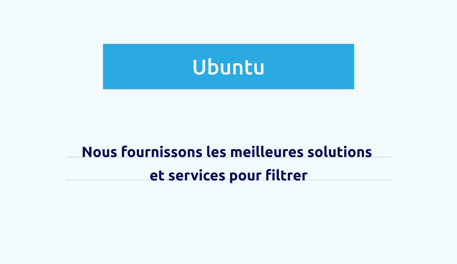
Ubuntu and DIN NEXT Arabic for Typography
Ubuntu's modern and clean style conveys a contemporary and professional look, while DIN NEXT Arabic ensures readability and simplicity. This combination is ideal for creating a user-friendly interface that enhances the user experience.

Home Page
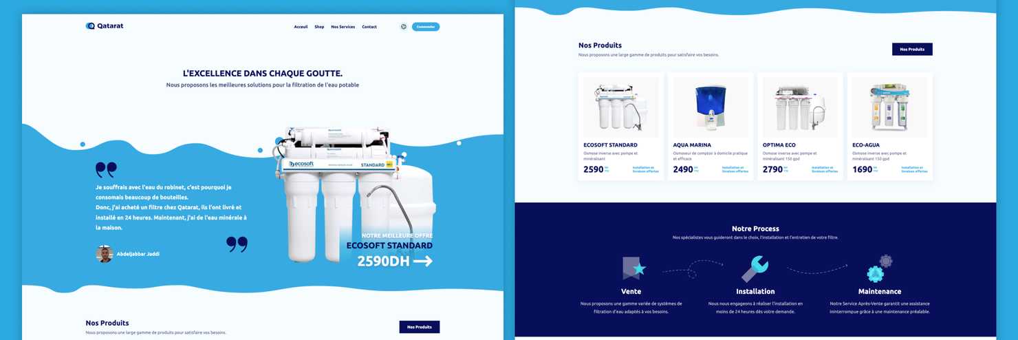
The home page is designed to create a positive first impression and introduce the brand. It features a hero section, services section, featured products section, and a contact section at the end. Each section has a call to action that guides users to the main service and encourages engagement.
Product Page
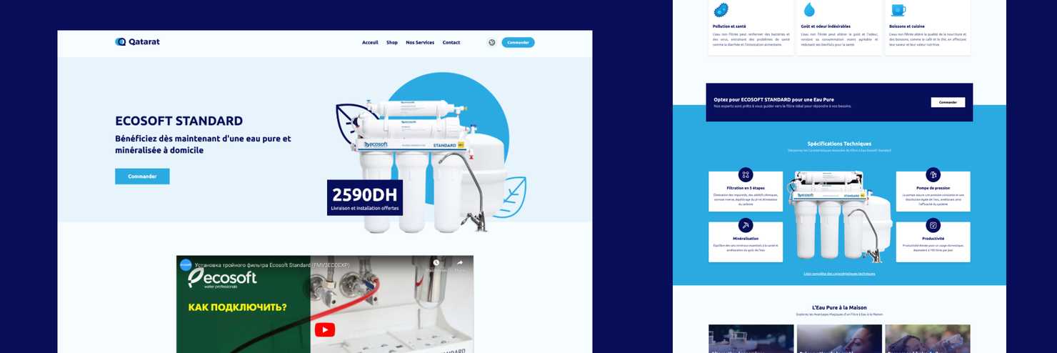
The product page is meticulously designed to provide detailed information about Qatarat's water solutions, featuring high-quality images, comprehensive descriptions, and specifications. Customer reviews and ratings enhance credibility and trust. Each section includes clear call-to-action buttons, guiding users smoothly from product selection to ordering.
Mobile Version
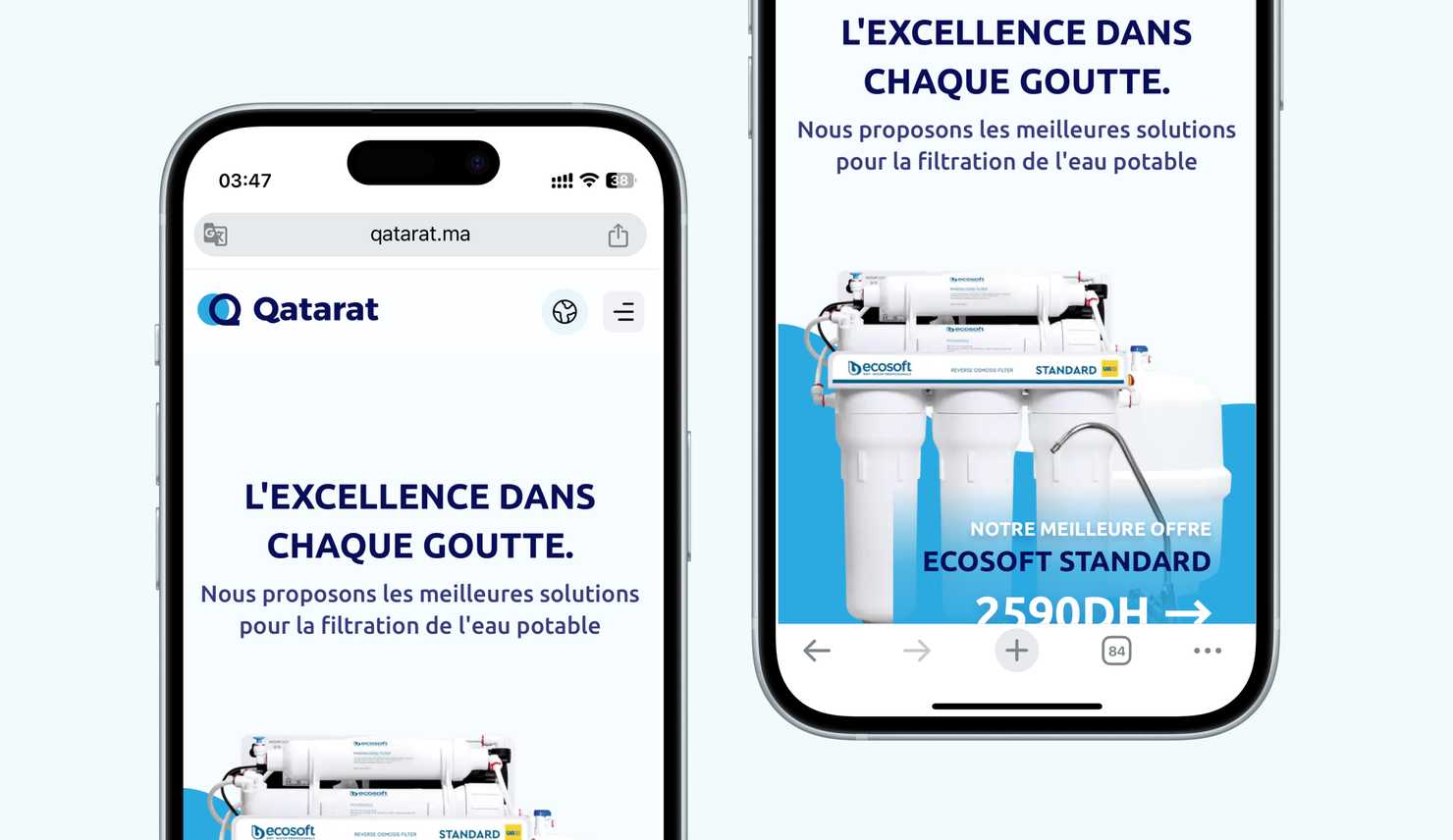
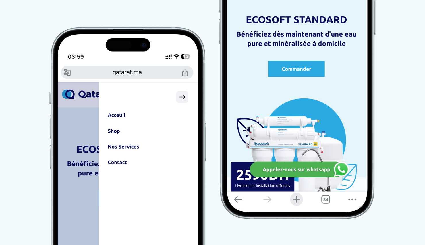
The mobile version is designed to provide a smooth and intuitive browsing experience on smaller screens. Users can easily navigate through the site, view products, and access the ordering form, ensuring a hassle-free process on mobile devices.
